September 2023- Starting pocko/ ‘Gallerina’ at Pocko
I kicked off the DPS term working at Pocko Artist rep agency, woohoo! Initially I was a bit skeptical about continuing working at Pocko as it was not a design company and would’t directly benefit my discipline which is brand identity design, however I decided to continue because at Pocko, people that work there take on so many different roles that I believed that I would be able to use my creative skill in some way there.
The first couple weeks was a bit boring because all I was doing was research and reading out the artists they represent and getting to know them. The type of research I conducted was gathering contacts from brands and non profit organisations in order for the agents to reach out to them and propose a collaboration. I also researched alternative artists that had a similar style to Pocko’s roster and adding them into their database.
My research skills definitely improved immensely at Pocko and I also leaned to use Notion as an organisational tool that will be very helpful for me in fourth year when I need to organise myself and my projects.
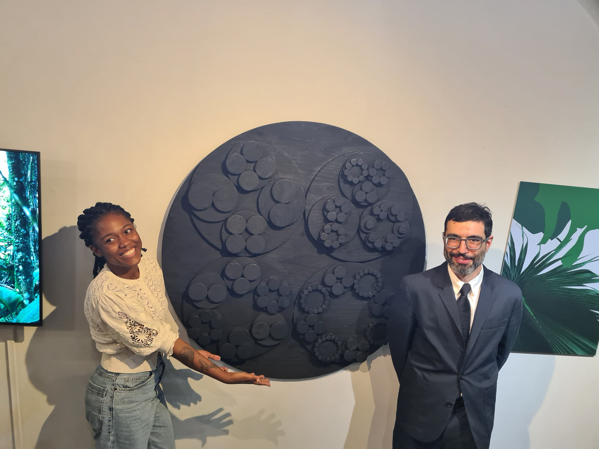
After 2 weeks, things started to get interesting as one of the roles at Pocko was to support with the frequent exhibitions and shows that the host featuring Artist’s work. I worked on setting up the gallery space for the exhibition “Senescence” by David Cuesta.
One of the most striking pieces in the gallery was the sculptural representation of the artifact featured in the film. Crafted meticulously from 193 pieces of layered plywood, it was burnt and sealed using the Japanese Shou Sugi Ban technique, a traditional method of wood preservation that employs fire and water to seal the surface. The layered wood formed intricate geometric patterns, alluding to genetic mutagenesis. Notably, one disc's pattern did not divide equally, symbolizing the initial breakdown in the cellular senescence process.
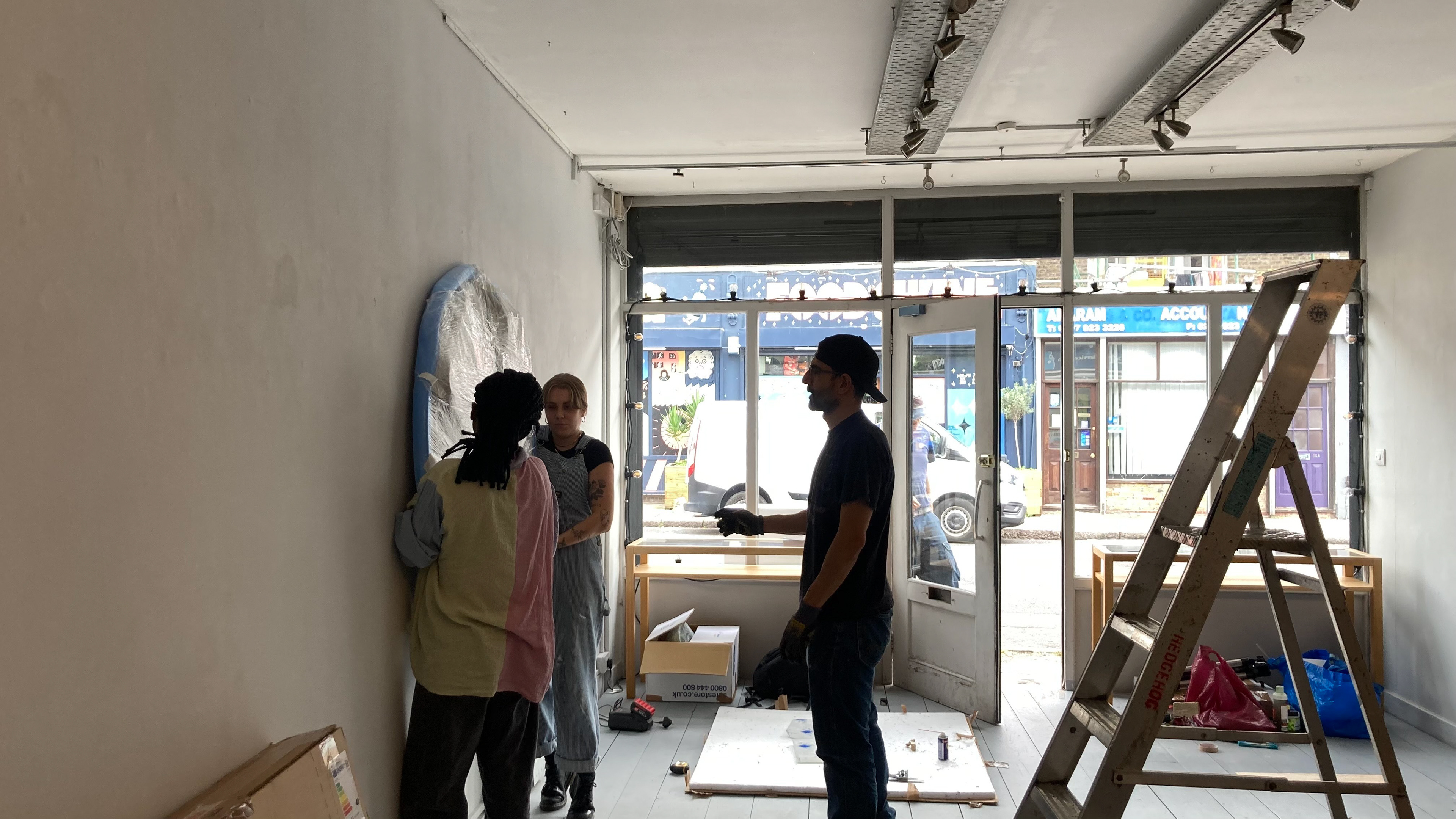
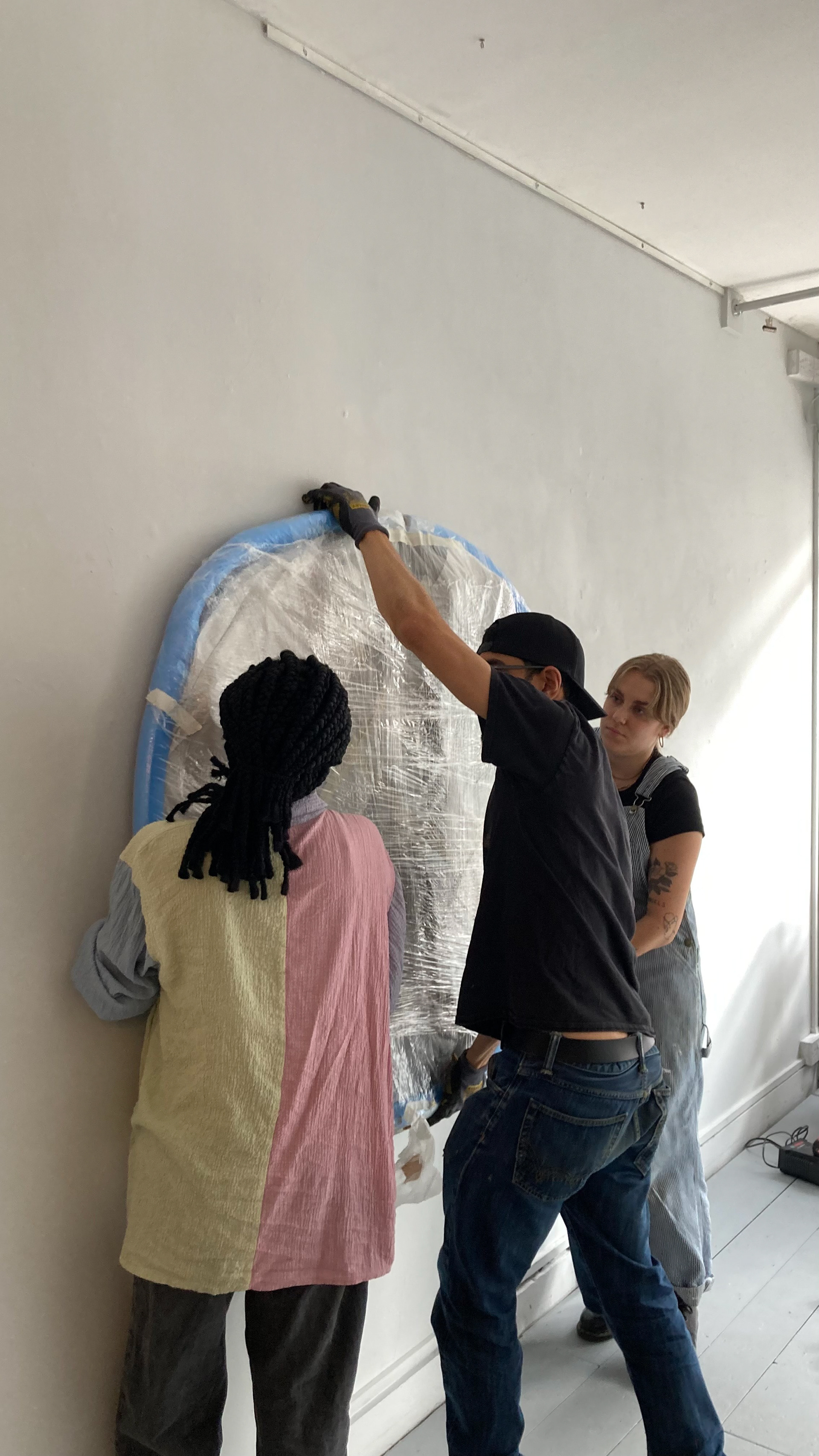
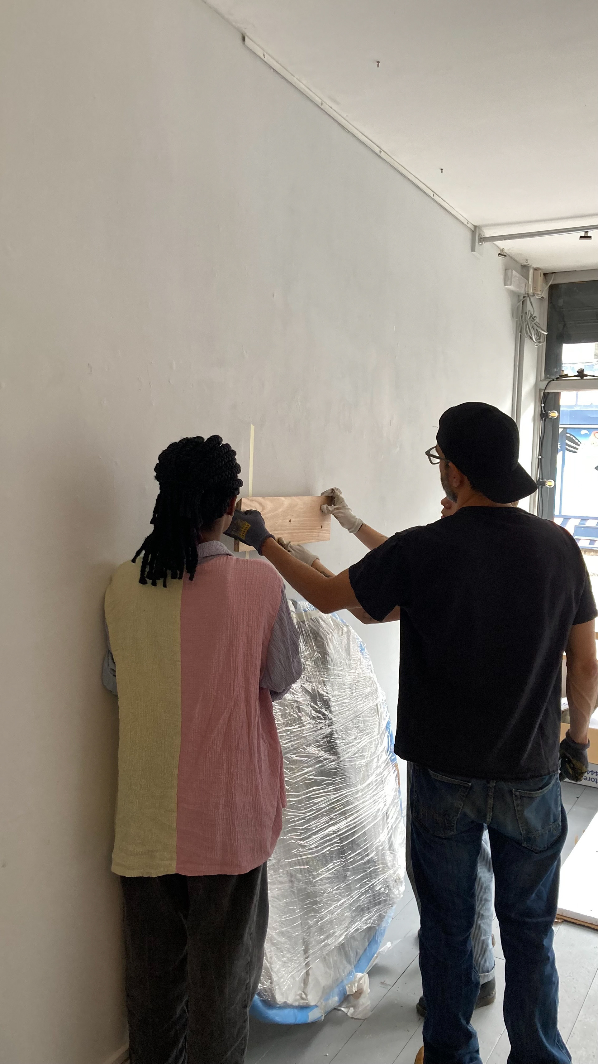


My role as a gallery assistant was multifaceted. I was responsible for using power tools to assemble and display various artworks. Spatial planning played a crucial role in ensuring that the artworks were arranged to create an immersive and engaging experience for visitors.
Working closely with David and the team at Pocko allowed me to gain a deep understanding of the intricate process of curating and setting up an art exhibition. The exploration of the concept of senescence through art was thought-provoking and left a lasting impact on me.
October 2023- Nadiia - Magpie’s nest
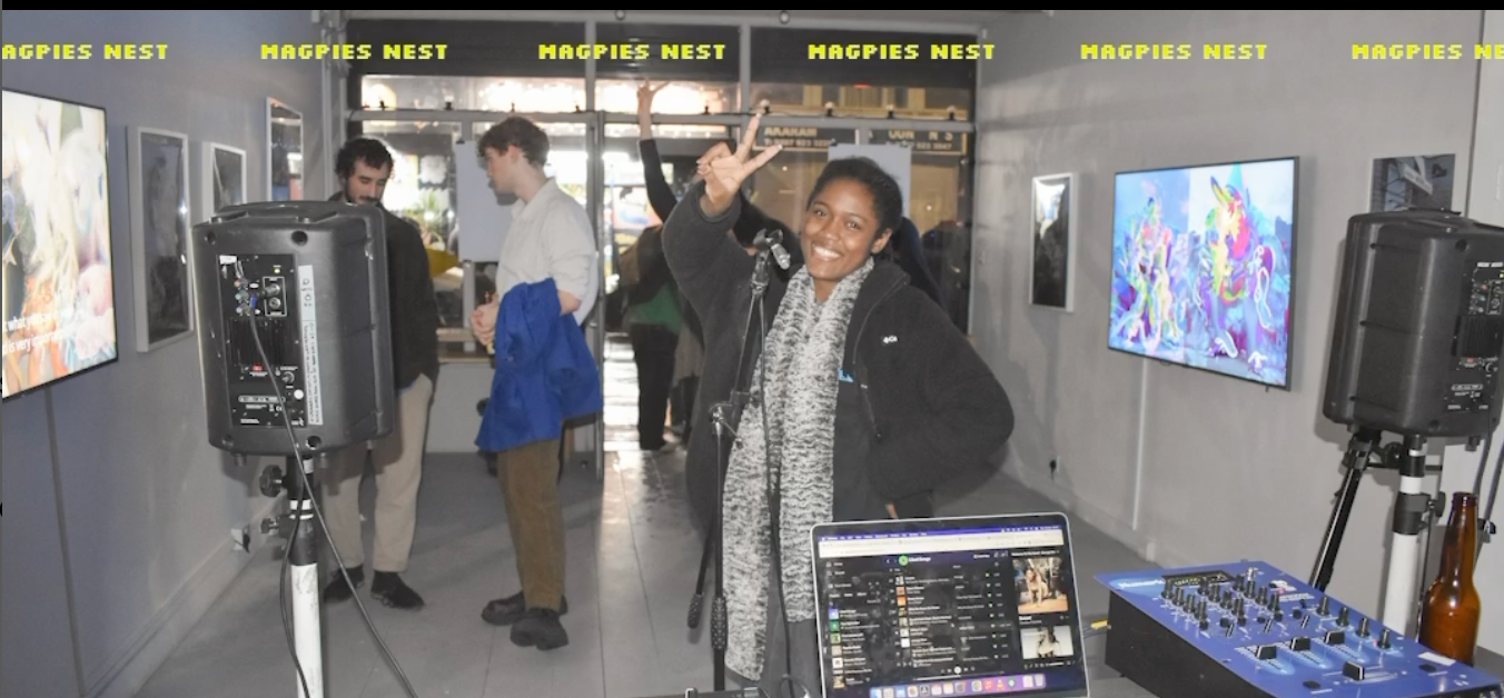
After David’s exhibition, we had another exhibition featuring one of Pocko’s artist’s, Nadiia Plyamko’s work. She is a Ukrainian CGI Artist and the exhibition was titled magpie’s nest.
I worked with the creative director, Nicola, on setting up the gallery space for the exhibition.
November 2023- Netflix Project
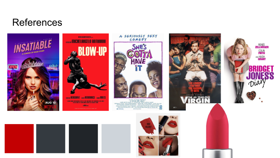
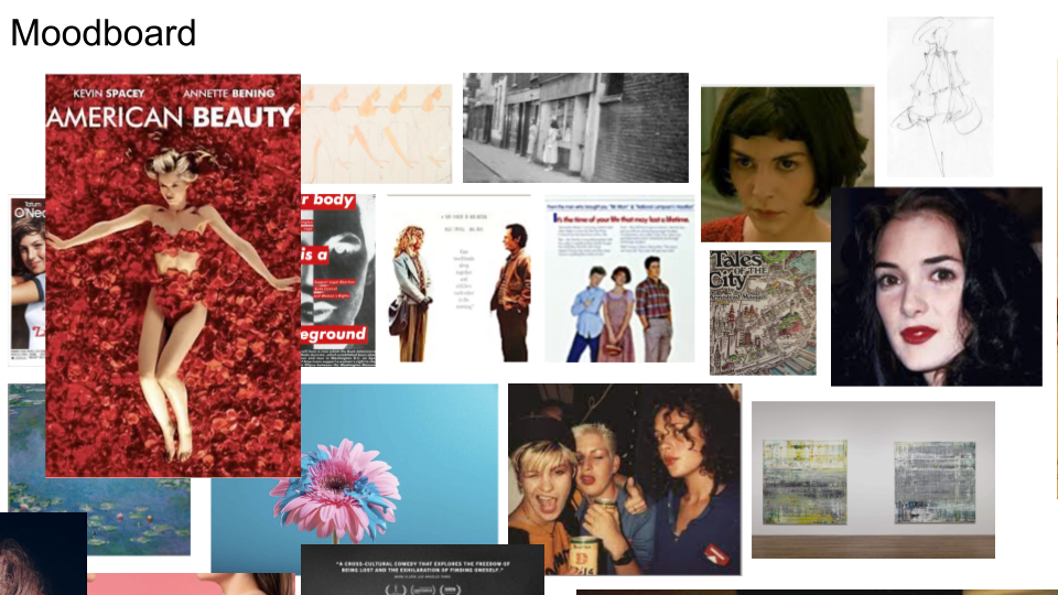
To further my DPS experience, I participated in a University project where the brief was to design a film poster for the students of the MA Scriptwriting course for their pitch to Netflix.
This project gave me insight into how to collaborate and liaise with a client in successfully bringing forth a beautiful vision into reality. I worked on 2 scripts, BLOOM and Hearts of Stone.
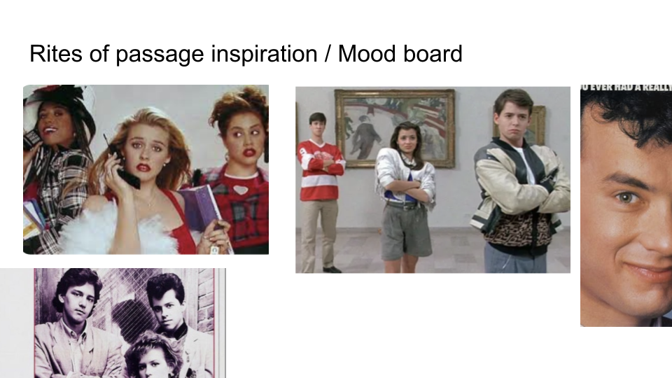
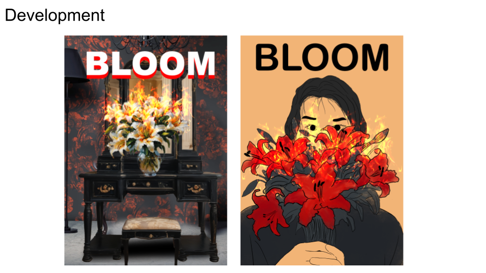
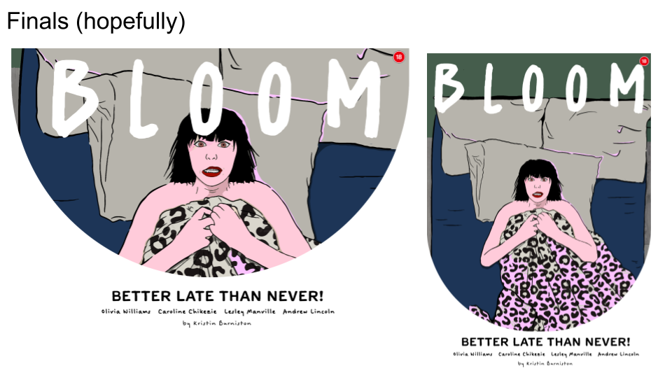
Bloom is about Aggie, a 50 year old virgin who is also experiencing menopause and navigating the world of love, sex and friendship while trying to figure out what she wants for herself.
The vision of the poster was to communicate the feeling of menopause and spotlight the main character and make the poster relatable to people.
Working with Kristin, the scriptwriter, was an amazing experience as she is a very experienced person and was very clear in her communication but was also open to hearing my suggestions as a professional in my field. She helped build my confidence and communication as a designer.
The title of her project evolved from “Aggie” to “Bloom” as she was having trouble with naming her script and I supported her with reaching the title “Bloom” through intensive research.
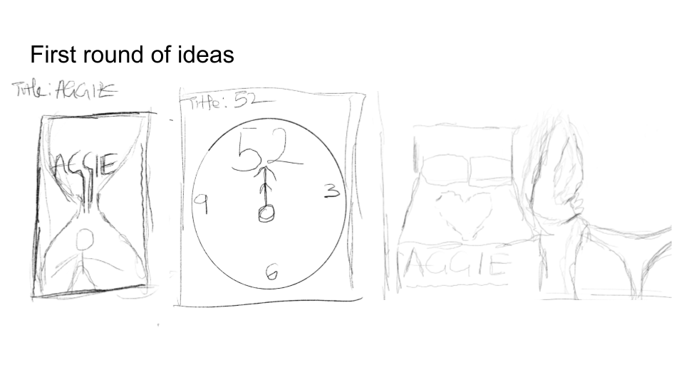
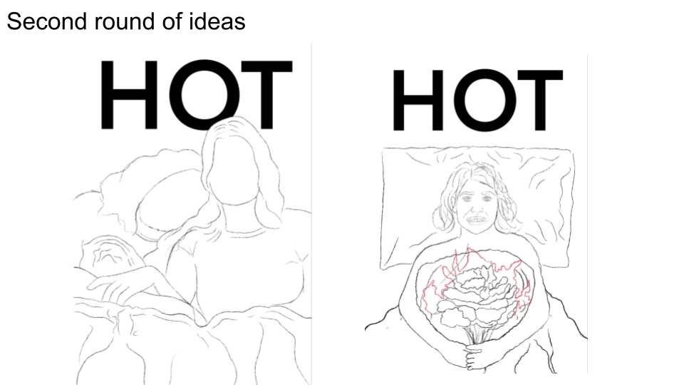
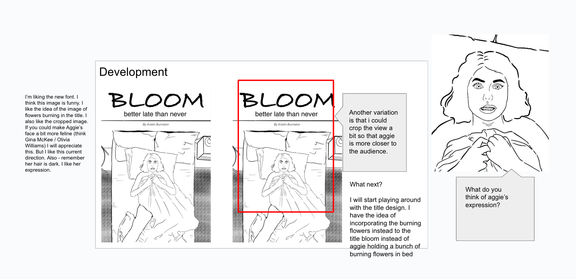

process
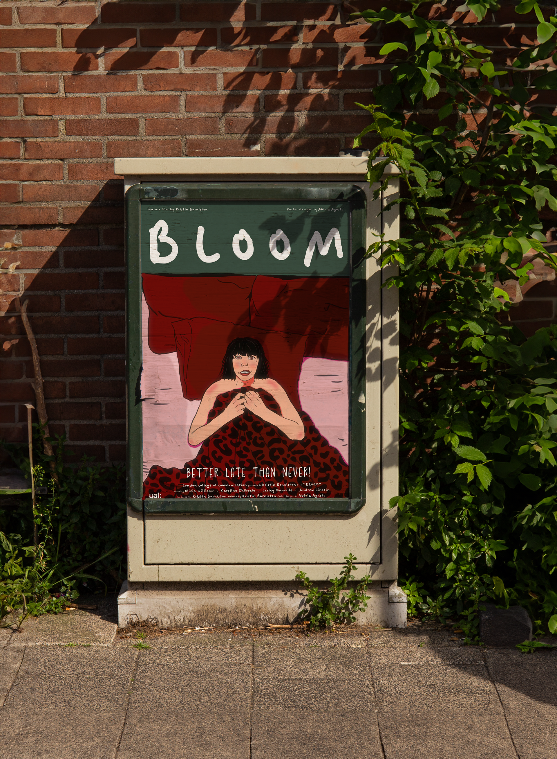
final design
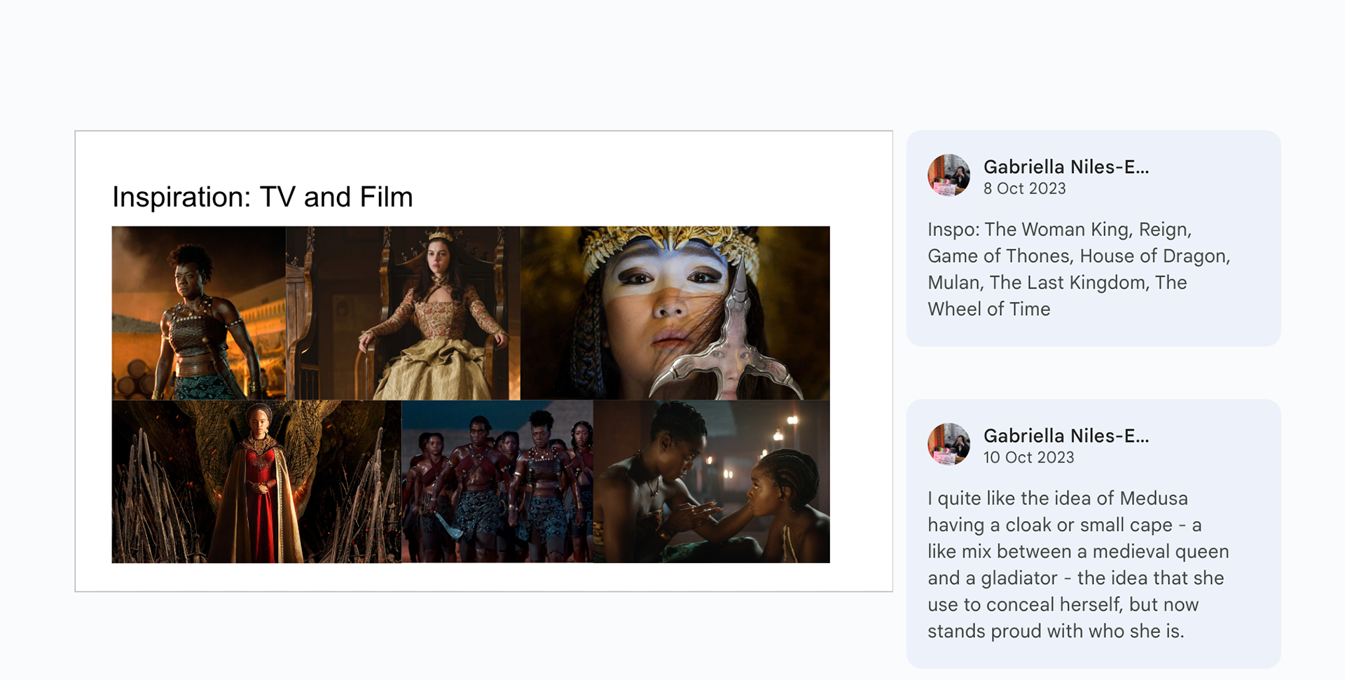
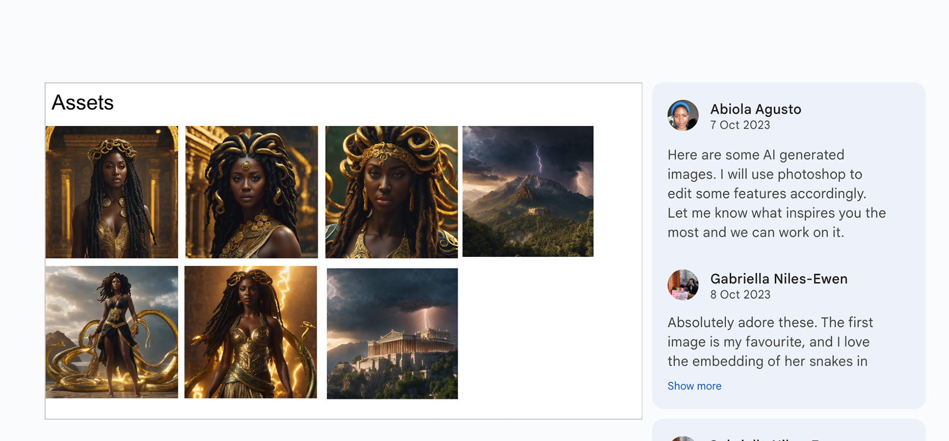
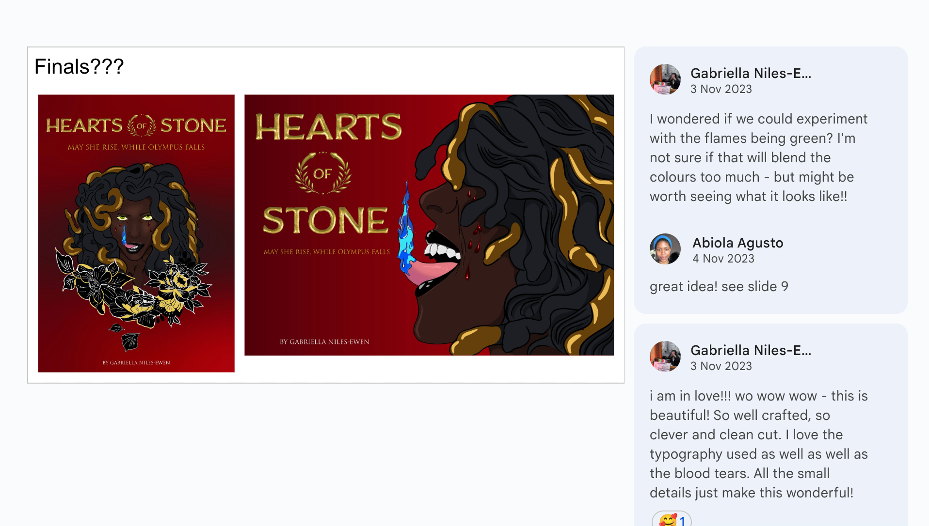
Hearts of Stone, written by Gabriela is a twist on the greek mythology of Medusa however she is a powerful black woman whois seeking revenge and justice on the gods of Olympus that had forsaken her.
Gabriella was more of the type that gave me total creative freedom and was happy straight away with my first draft.
For her poster, I also designed an icon that could be used in presentations when she is putting together presentations for her script.


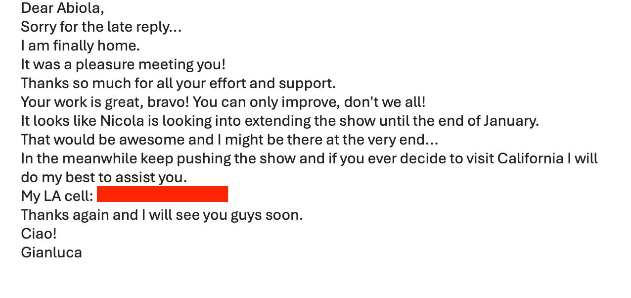
I supported Nicola with setting up the gallery for the exhibition of Photographer Gianluca’s work titled ‘Welcome Home’.
The experience was great and I even made a connection with him and he sent me this email (screaming!).
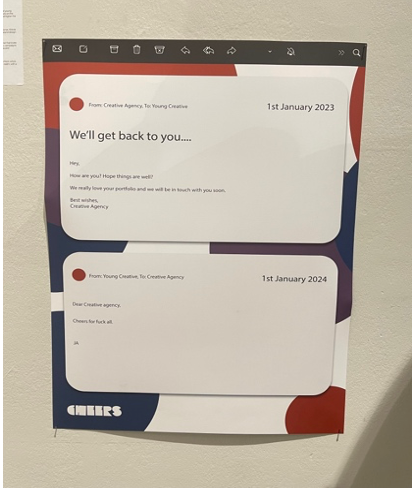
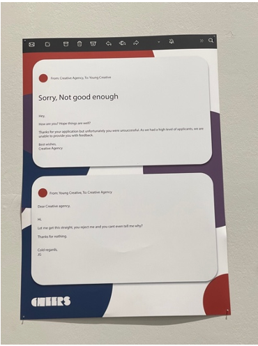
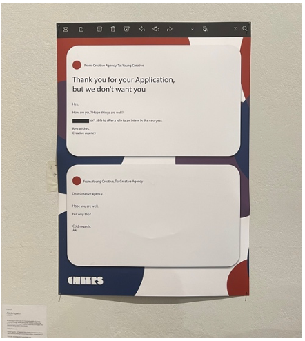
I also started my Self initiated project titled, CHEERS which explored the issue of emerging creatives breaking into the industry and it explores ways if increasing visibility and heighten the chances of recognising. CHEERS is a collaborative project with my fellow course mates, Joe and Justina.
The project started off by exploring and addressing the issues of visibility of emerging creatives and how brands or agencies fail to respond to applications, even if it’s been unsuccessful and when they do respond, they fail to provide constructive feedback that is helpful for personal development.
January - February 2024- DPS Journey’s Exhibition / Pocko japan website re-design / Trellis communication design
Our work in progress was showcased at the DPS Journey’s exhibition an UAL:LCC.
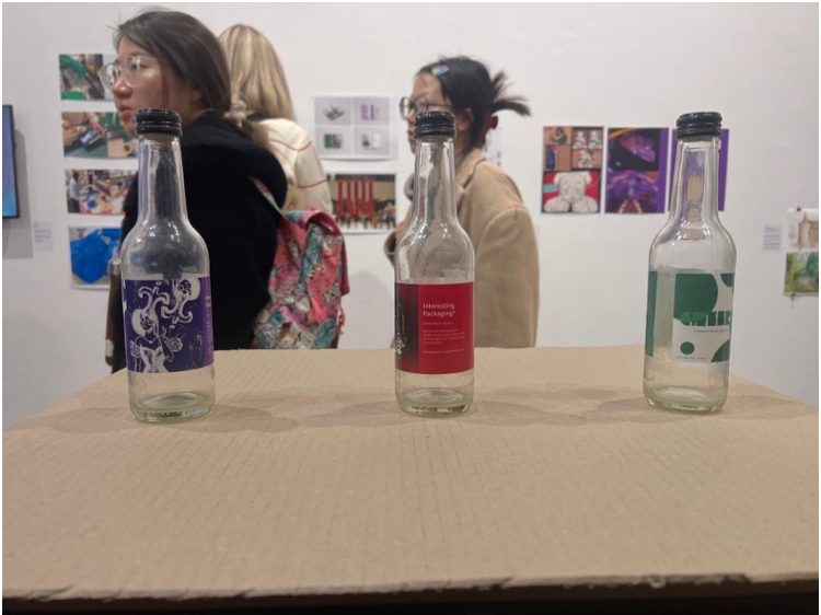
We designed a campaign that involved utilising the drinks packaging space and creating labels that feature artists work as the main headline as a strategy to get noticed by brands or creative directors. The idea is that drinks are everywhere, therefore it can infiltrate creative spaces and in a way spark conversation or interests from brands or creative directors to know more about the artist.
We designed a campaign that involved utilising the drinks packaging space and creating labels that feature artists work as the main headline as a strategy to get noticed by brands or creative directors. The idea is that drinks are everywhere, therefore it can infiltrate creative spaces and in a way spark conversation or interests from brands or creative directors to know more about the artist.
Pocko asked me to extend my internship with them because I’ve been doing a really good job (he-he) so I did, for the next 3 months. I expressed to them that I would like to be involved in more design based tasks so we agreed that I can work on re-designing the Pocko Japan website.
I learned a lot about UI/UX and also learned a little bit of coding with custom CSS! It was an amazing experience and I now have a new skill under my belt.
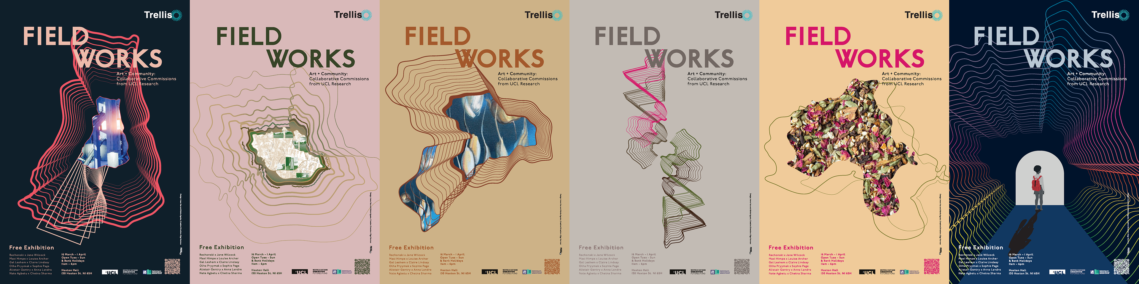
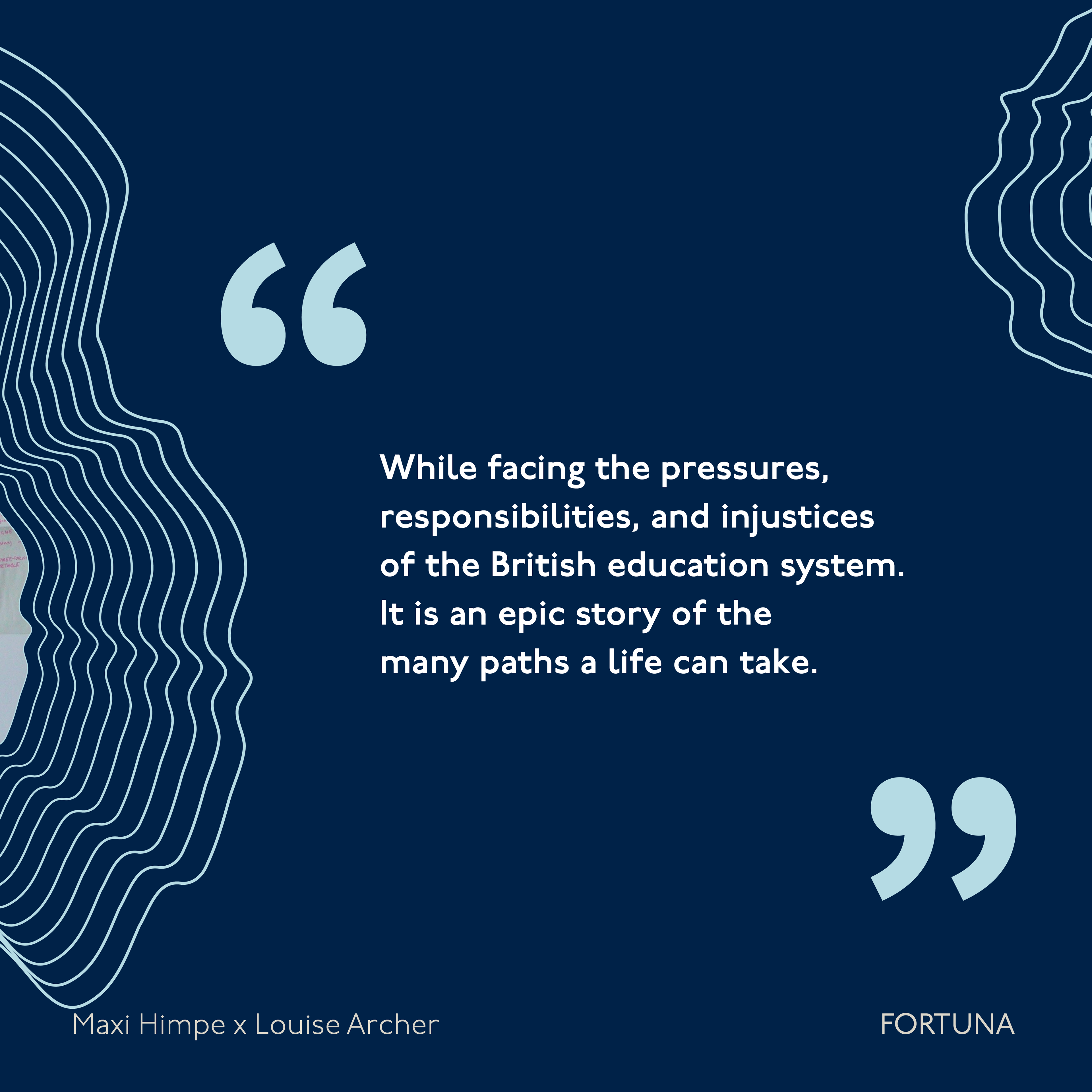
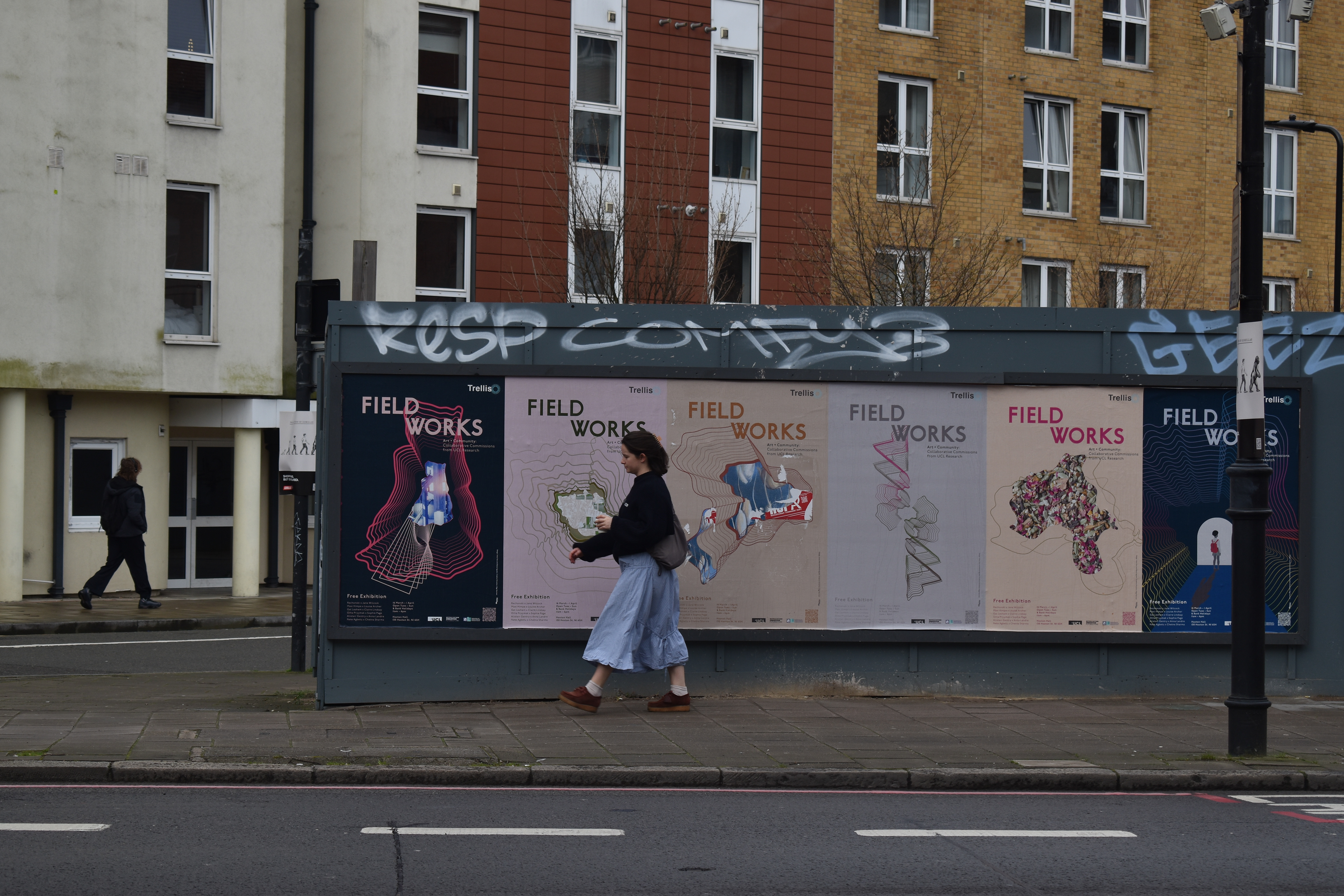
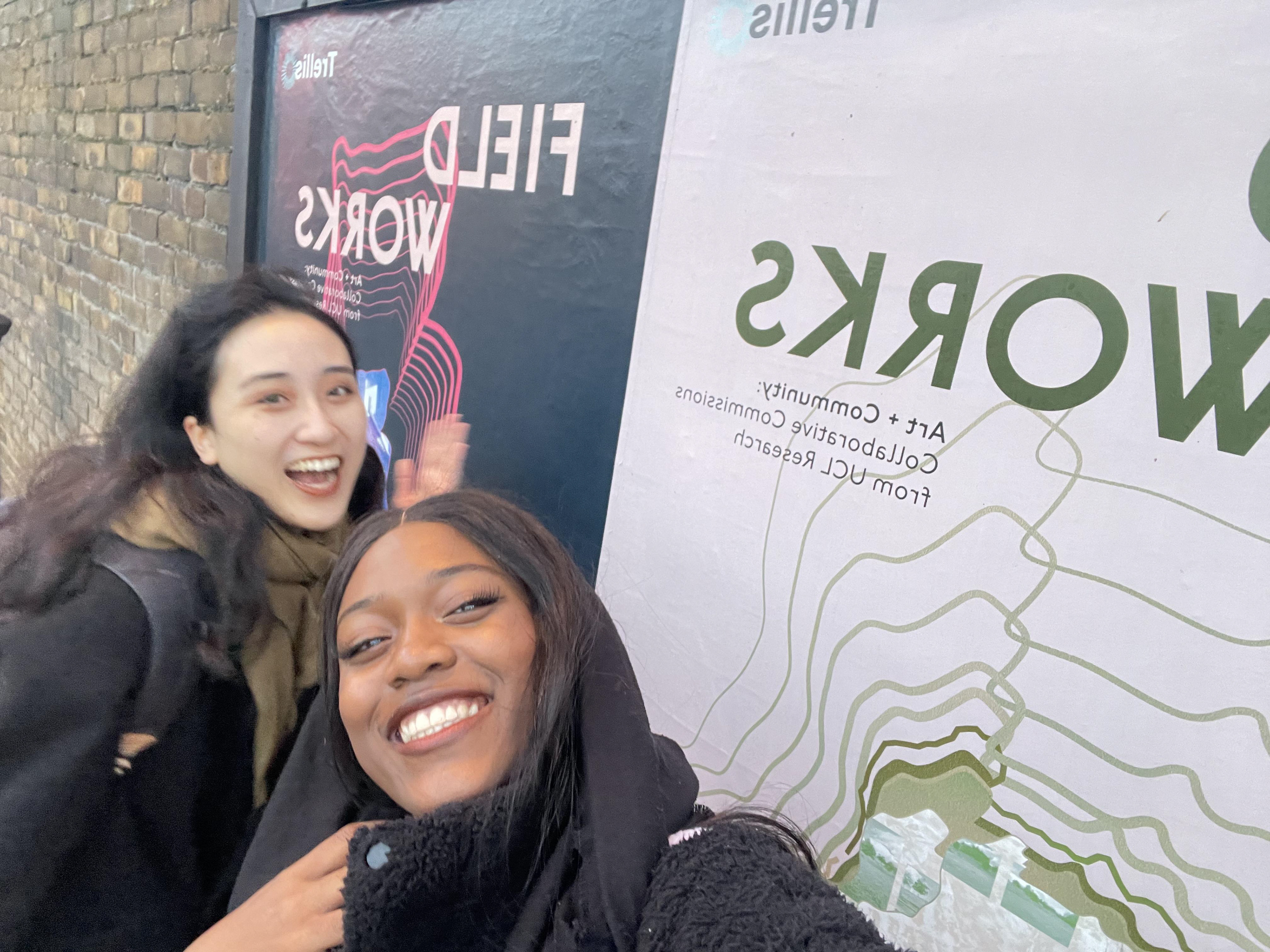
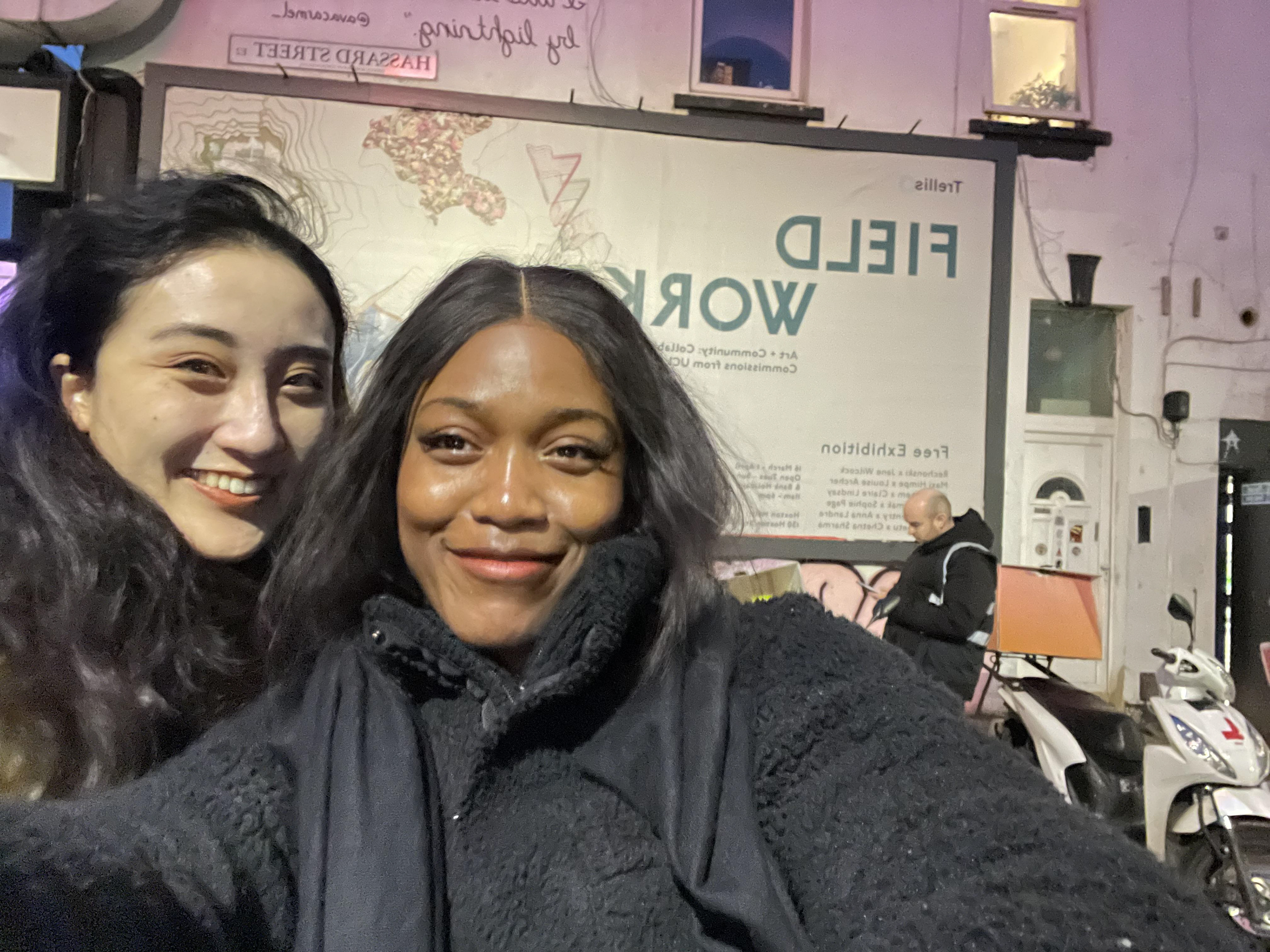
I also had the privilege to work on designing the communications for UCL Trellis exhibition with Pocko Agent/Designer, Irene and Creative director, Olga. The exhibition was titled Field Works which features work from 6 Artist’s that talk about issues surrounding disability, education, history, gender, voices, and culture.
I was responsible for redesigning their logo.
old

new
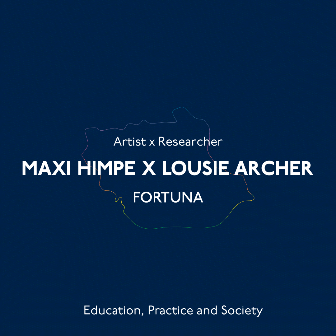
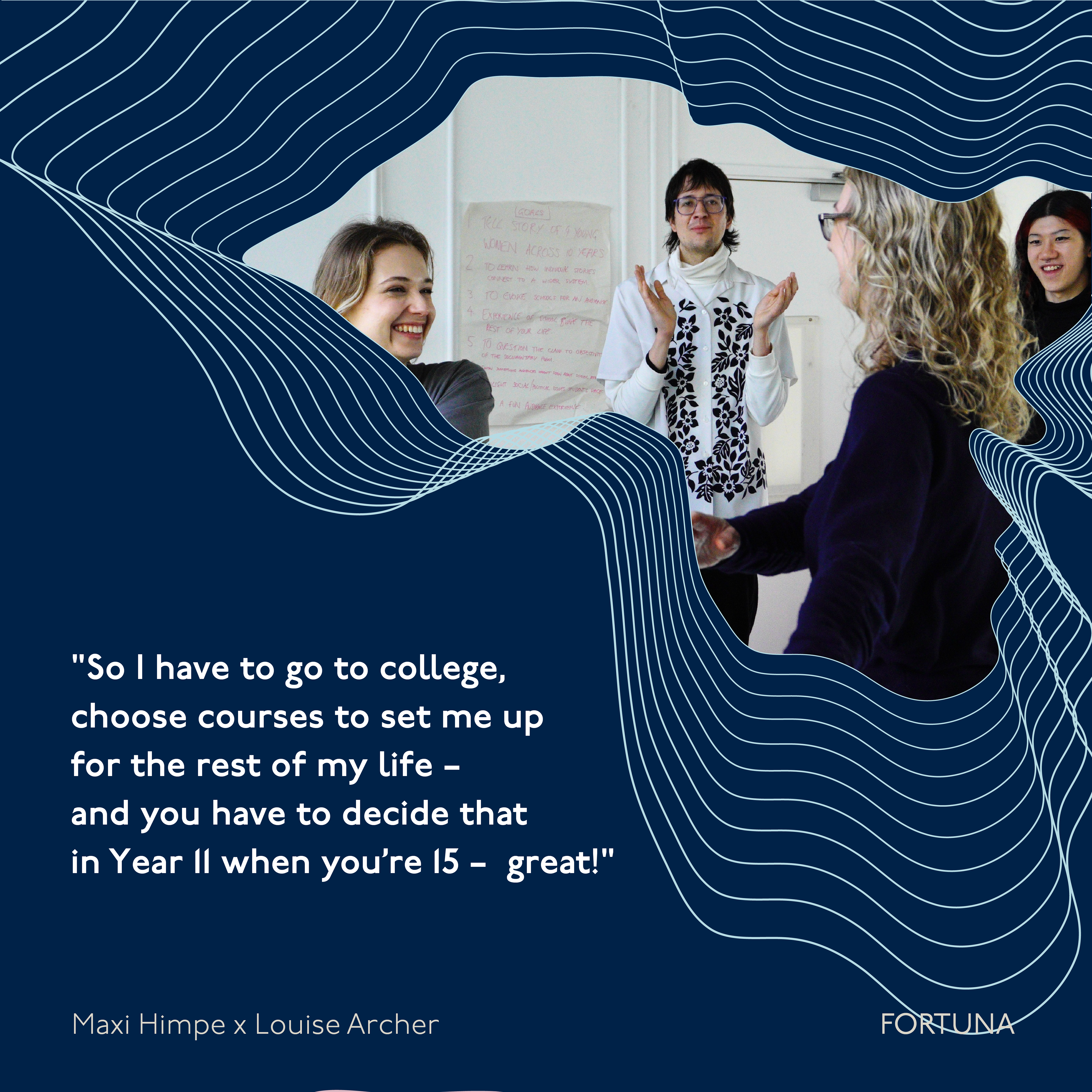
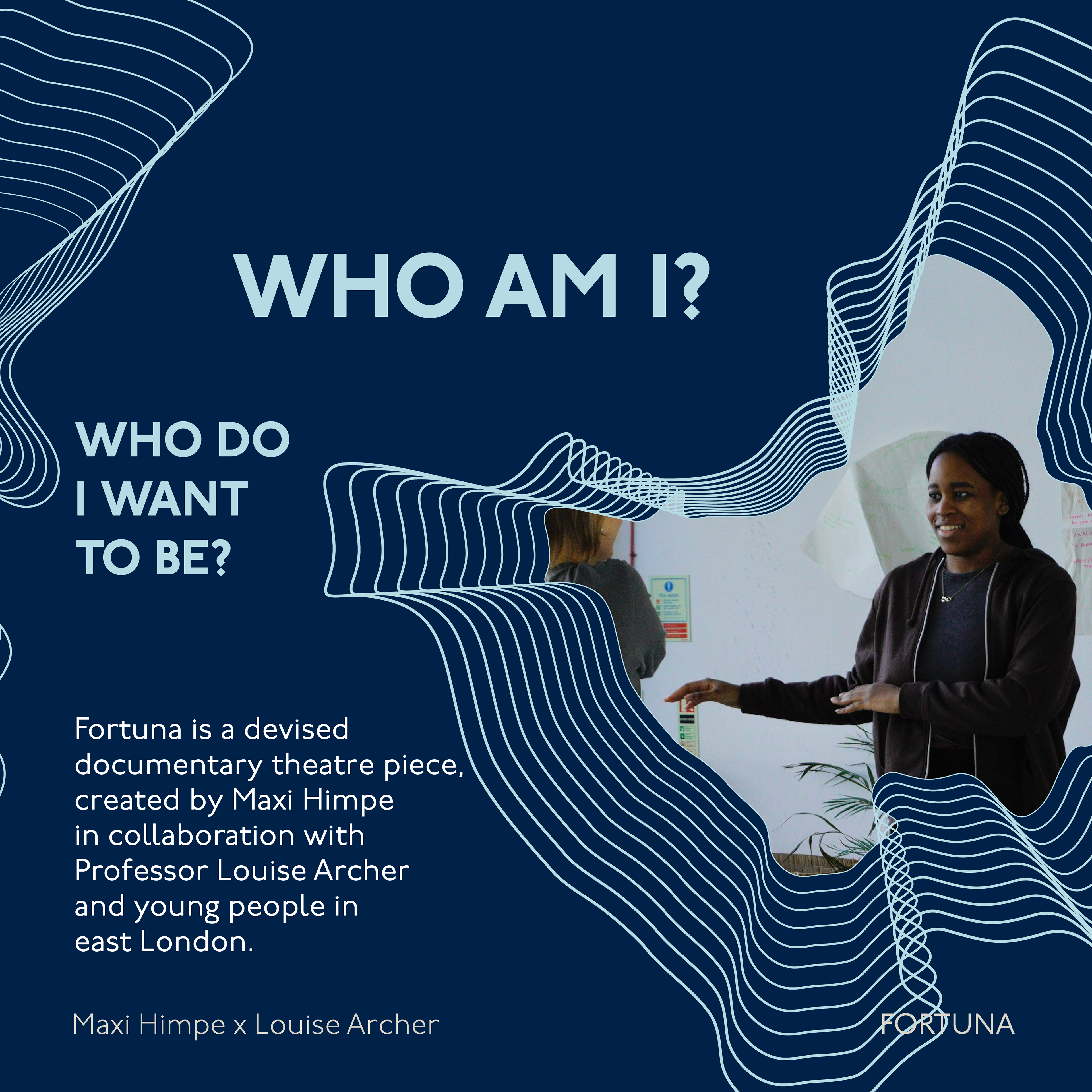
I co-designed the posters which was a series of 6 posters to represent each of the 6 artists. I particularly worked on Maxi’s poster, who’s work is a performance piece and lacks imagery, therefore I had to illustrate the whole poster from scratch.
and social media posts.

I also designed some print materials for the exhibition such as a 4 fold leaflet/floor plan, context panels and way-finders.
I truly learned and utilised multiple skills during this project such as poster design, brand design, social media design and motion design
March 2024- Trellis ends / Light Spectrum Collective / BAMBUU Incubator programme
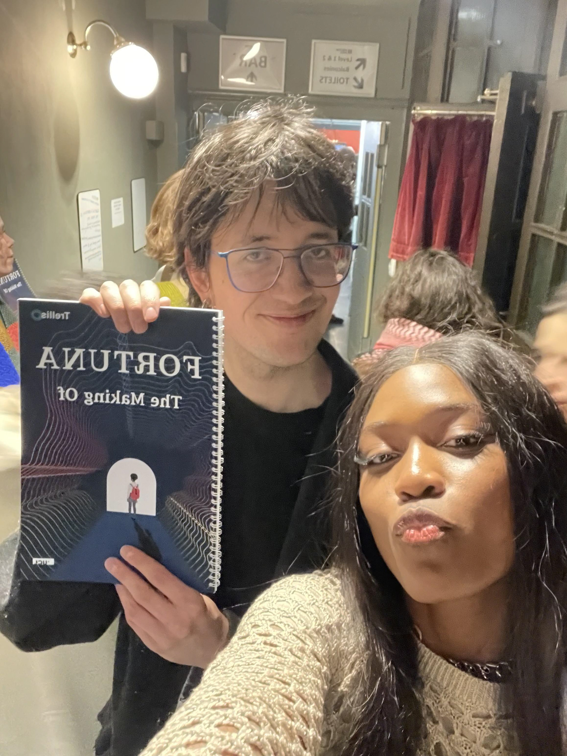
As the trellis project comes to an end, my time with Pocko also ends. Going to the exhibition and seeing my work in real life was an amazing experience and I felt so accomplished. I met Maxi, one of the 6 artist’s and they were impressed with my work and is eager to work with me on creating material for their other performance pieces in the future.
maxi
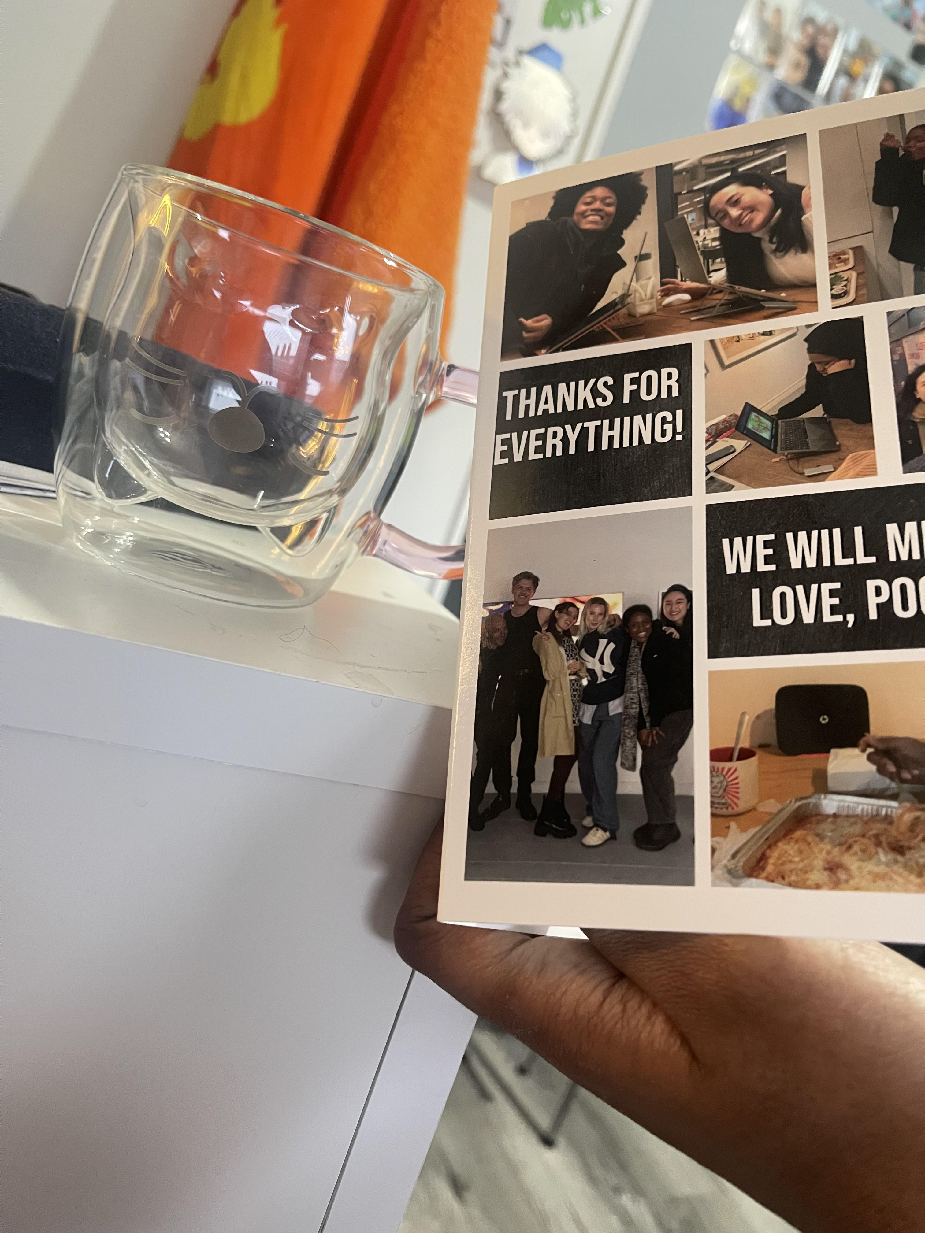
My time at Pocko was truly amazing. I learned more than enough and made some valuable friendships along the way. I even got a leaving gift!
After Pocko, I continued my DPS Journey by joining the Light Spectrum Collective which is a collective of creatives from different disciplines coming together to tackle social issues in creative ways.
My role was to co-design the Light Spectrum brand identity. The idea behind the brand is to represent the diversity of the collective. This was reflected in the graphic element of the numerous lines the make up the logo’s structure.


I also got accepted into the BAMBUU Incubator programme which is a programme that supports students in potentially turning the SIP into a business model. The programme helped CHEERS evolve into 3 segments all with a goal of representing emerging creatives and increasing their chances of visibility. This includes:
- A branded communication kit which was managed by me
- A branded website outlining the initiative and a space for creatives to download templates to design their communication kit themselves managed by Justina.
- A curated book representing artists with interviews of them managed my Joe
April 2024- Light Spectrum: Selfridges
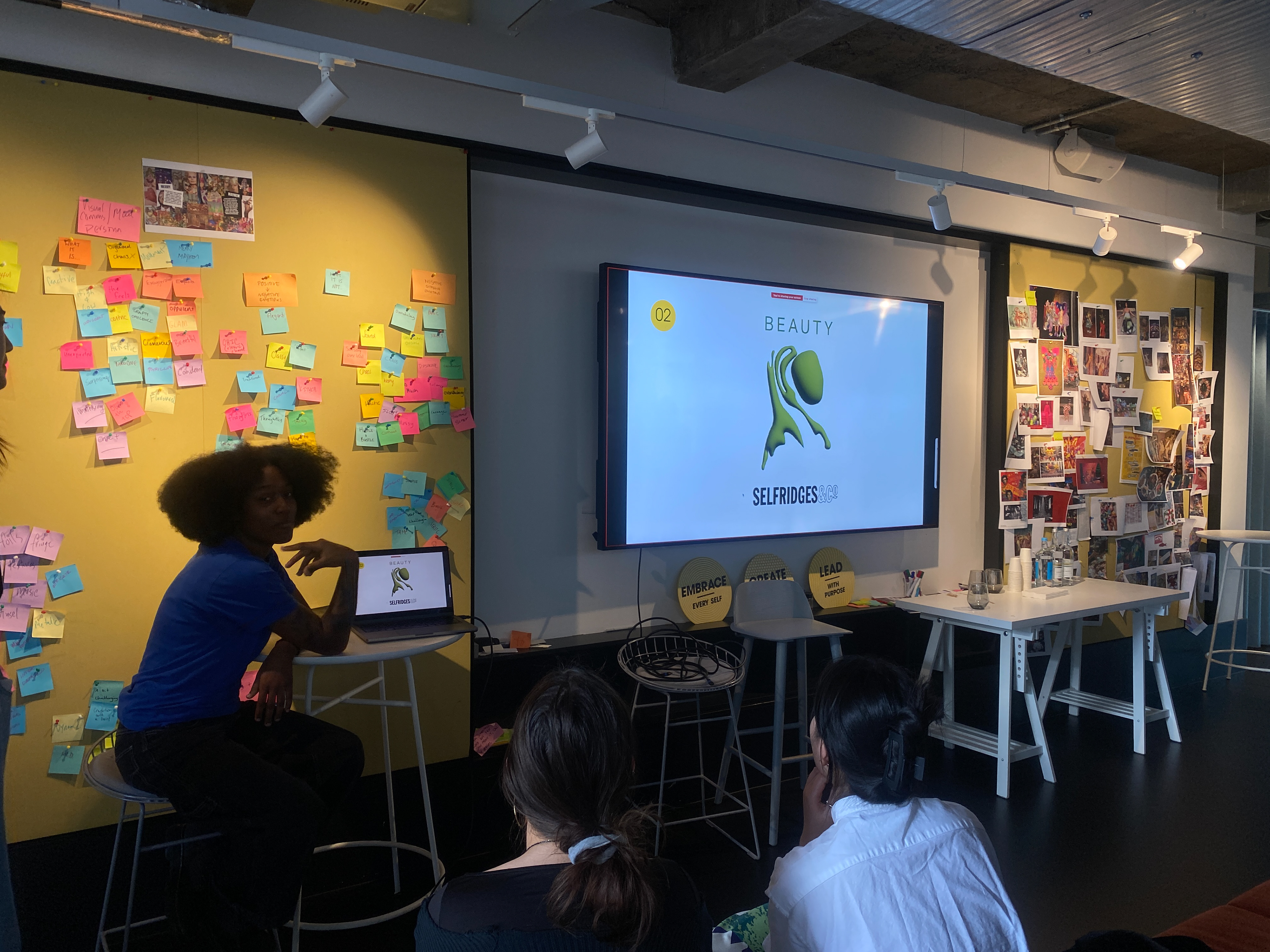
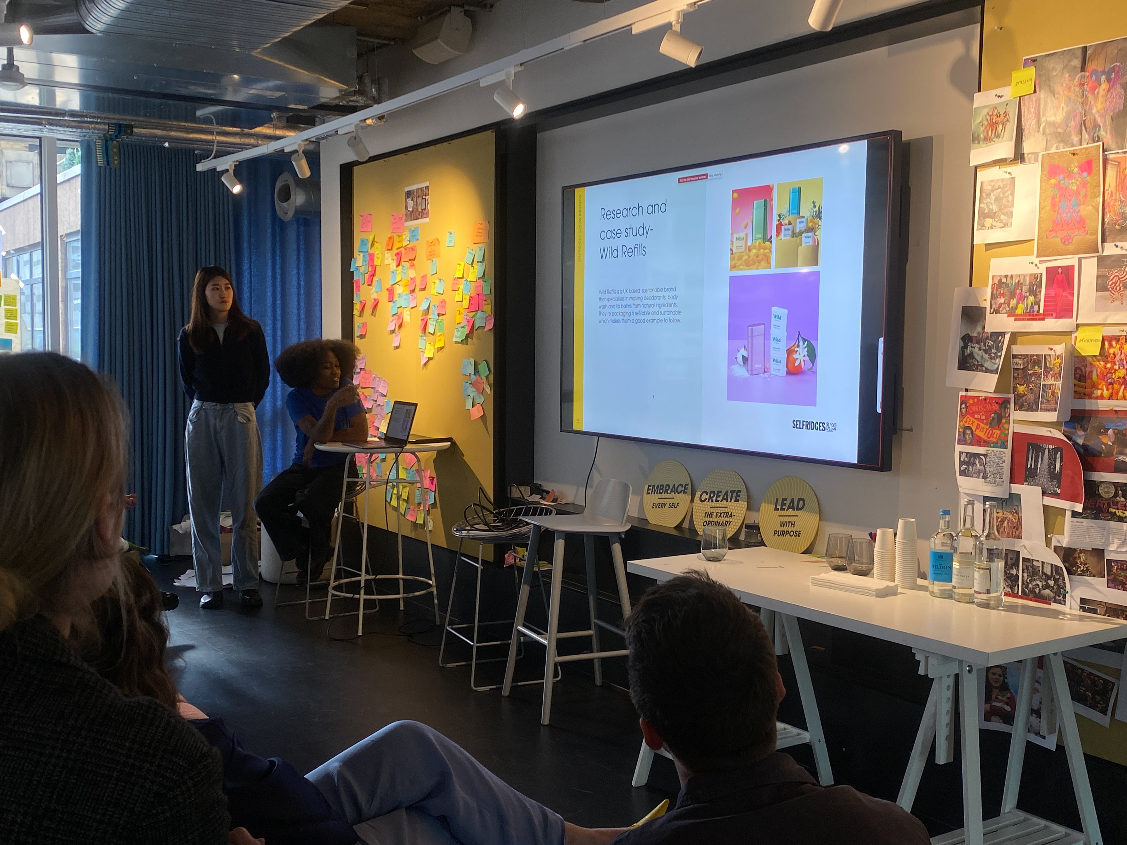
The light spectrum worked on the Selfridges project earth brief where we were tasked with coming up with a design solution that could contribute to the campaign of selfirgdcs project earth initiative.
I worked on the beauty pavilion idea which is the idea of growing natural products and using those products to create DIY natural beauty products such as makeup and deodorant.
Then we pitched in person to the Selfridges creative team at their studio which was amazing!
You can find more details on the light spectrum website here
May 2024- Dixon Baxi
In order to gain some insight into the Light Spectrum collective branding Sarah arranged an in-person meeting with the creative director of Dixon Baxi creative studio, Simon.
He gave insight into building a brand world and touching on the unique characteristic the spectrum being the main focus in informing our brand identity.
His advice was very helpful and gave me some motivation to focus on making Light Spectrum a successful collective in the long run.

My next steps for the future would be to focus on my making the Light Spectrum collective and my Self initiated project a reality.
Author- Abiola Agusto
Course- Graphic Branding and Identity
Links: Autumn Blog, Spring Blog